Resource Commercial Real Estate
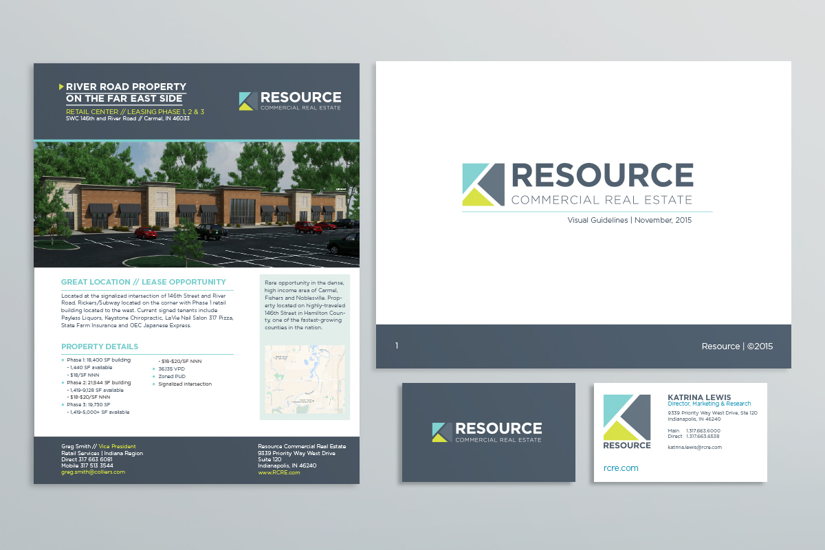
Resource Commercial Real Estate (RCRE) approached us to help re-launch their brand and visual identity. As part of this campaign, we were tasked to develop a strategy and execution around their visual identity, including a new logo, website and accompanying marketing collateral.
Resource landed an affiliation with Colliers International in 2010. By 2015 Resource made the decision to sever the partnership, thus giving them the opportunity to refresh their identity before entering the marketplace once again. During the five years of affiliation with Colliers International, the Resource brand was nearly forgotten. They needed a partner who could help the brand transition back into the commercial real estate market and provide an identity for them to do so.
Logo Design
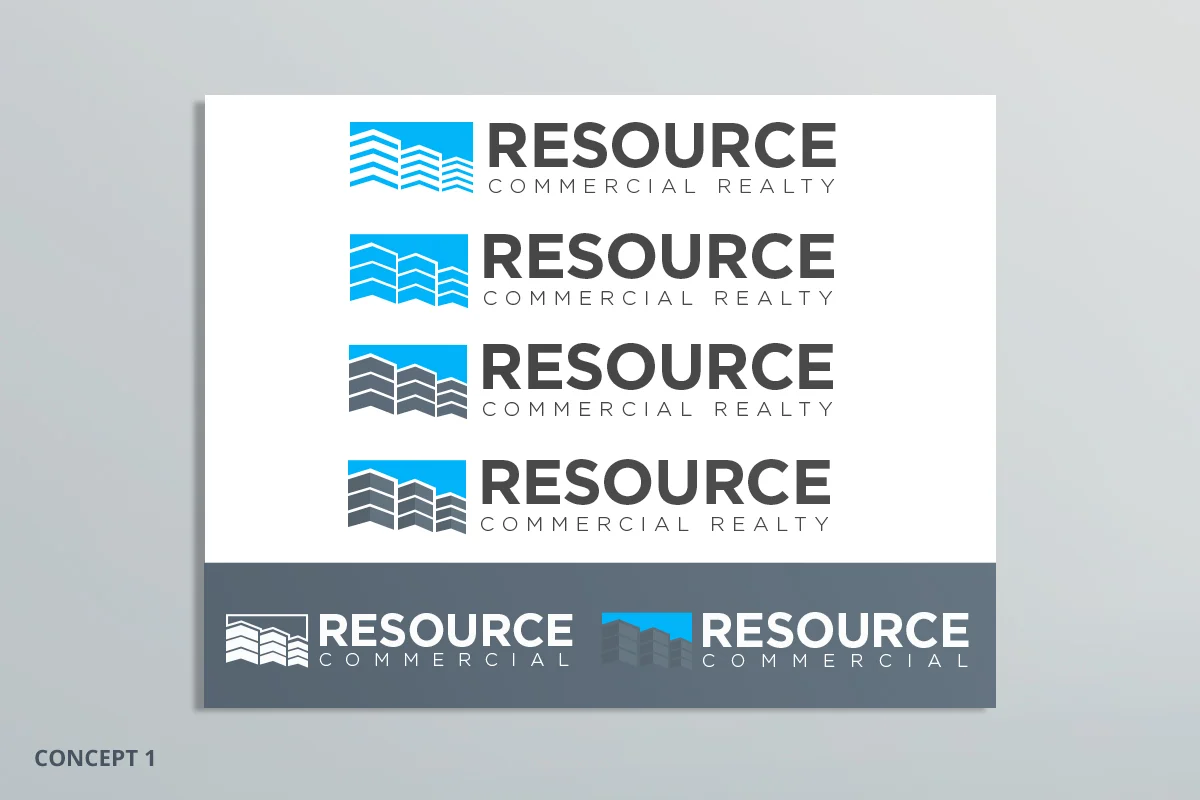
My team and I began work on a new logo and look for Resource upon their departure from Colliers International. We first examined the existing Resource logo. The client wanted to retain some of its visual identity, as they had legacy with that name before joining Colliers International. However, they were seeking a more modern approach, something that would help them stand out, yet feel familiar. We decided to keep the ‘Resource’ name front and center, but instead opted for an icon and color refresh.
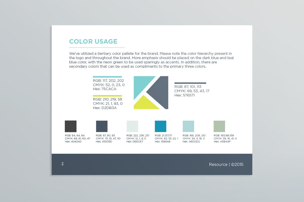
Our decision to go with a green & blue color pallet was based on the idea of land, water & steel, each symbolizing elements commonly associated with commercial real estate. The use of these elements lead us to think about city planning and maps. Inspiration was found through Google Maps by integrating a top-down perspective within the icon. The three shapes coalesce to represent a street intersection.
Website
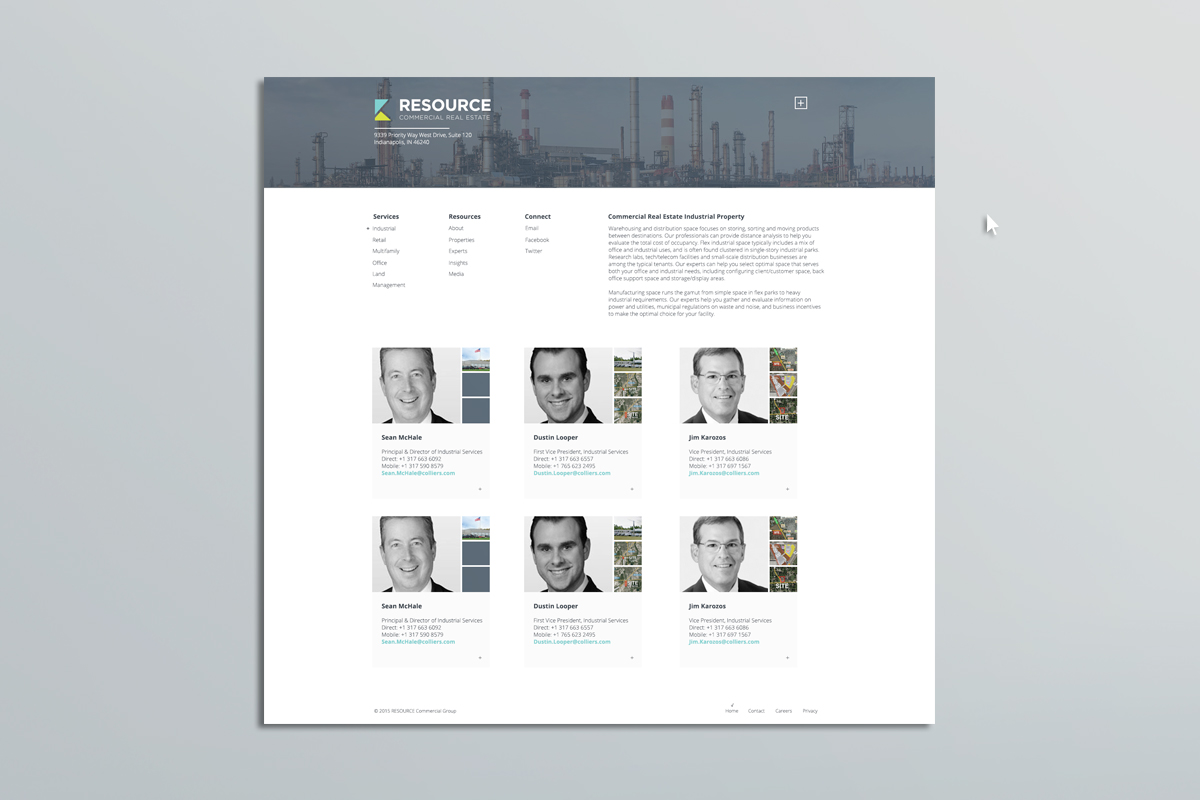
In addition to a brand refresh, I was also tasked with re-designing a website for Resource. Their old site was no longer accessible and needed to be built from the ground up - including all property listings and agent profiles. Many real estate sites felt dated and cumbersome, so I opted for a modern approach, something that would help them stand out while still providing the user with an easy experience to find the information they needed.
